
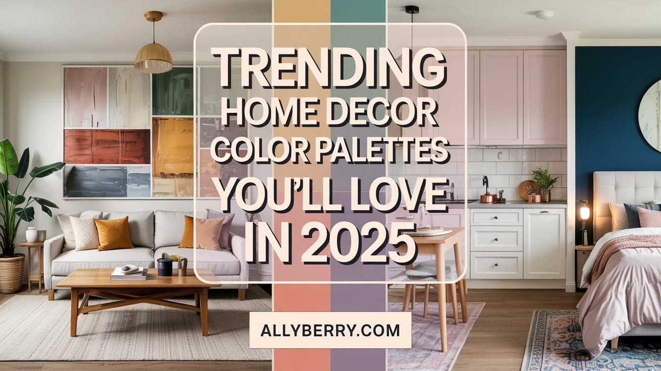
What if the secret to a stunning space isn’t just furniture or layout—but the colors you choose? I’ve spent years exploring how the right combinations can turn bland rooms into breathtaking sanctuaries. Let me show you why curated palettes matter more than you think.
A cohesive scheme does more than look pretty—it shapes how a room feels. Imagine soft lavenders and creamy whites creating calm, or bold teal accents energizing a neutral backdrop. These choices aren’t random. They’re tools designers use to craft moods, from cozy to vibrant.
Take modern grays paired with warm yellows, for example. This mix balances sophistication with cheerfulness—perfect for kitchens or living areas. I’ll share tips I’ve gathered from pros, like using lighting to enhance whites or layering textures for depth.
Want to experiment? Start small. Try burgundy throw pillows against a beige couch, or add indigo curtains to a bedroom. For endless ideas, visit my Pinterest page AllyBerryBlogger. Let’s make your space reflect what you love!
Key Takeaways
- Cohesive color schemes define a room’s mood and visual harmony
- Designer-curated combinations balance boldness and subtlety
- Versatile hues like teal or mauve adapt to multiple styles
- Small changes (like accent pillows) can refresh a space instantly
- Lighting dramatically impacts how colors appear in your room
- Explore my Pinterest board for easy, actionable inspiration
Overview of Home Decor Color Palettes
Ever walked into a space that instantly made you feel calm or energized? That’s the magic of intentional color schemes. I’ve learned through countless projects that hues act like silent storytellers—they shape moods, highlight textures, and even make small rooms feel larger.
Understanding the Latest Trends
Right now, designers are blending earthy terracotta with cool sage greens. One client’s kitchen transformed with deep red tiles against pale gray cabinets—proof that bold shades can anchor a room. The 60-30-10 rule works wonders here: 60% dominant hue, 30% secondary tone, 10% accent color.
| Scheme Type | Characteristics | Best For |
|---|---|---|
| Earthy Neutrals | Warm browns + soft greens | Living spaces |
| Jewel Tones | Citron + coral accents | Statement walls |
| Coastal Mix | Turquoise + sandy beige | Bathrooms |
Why Color Palettes Matter in Design
I once worked on a Craftsman-style home where forest green trim accentuated the woodwork perfectly. Colors should complement architecture, not fight it. Soft yellows make north-facing rooms sunnier, while navy blues add depth to vaulted ceilings.
Need inspiration? My Pinterest board @AllyBerryBlogger shows how mauve pillows pop against charcoal sofas. Up next, we’ll explore curated palettes that balance trends with timeless appeal.
Trending Home Decor Colour Pallettes: Curated Expert Picks
Designers often whisper about the power of paint colors, but what do they actually use in client projects? I’ve gathered exclusive tips from top creatives shaping today’s most inviting spaces.

Insights from Top Interior Designers
Hannes Peer swears by dusty blue for living rooms: “It’s like a deep breath for your walls—calming but never boring.” BEHR®’s 2025 palette proves his point with Aerial View, a sky-inspired hue perfect for functional spaces. Meanwhile, Martyn Lawrence Bullard’s eggplant purple makes bold statements in fabric choices or accent walls.
Three pro-approved combinations:
- Benjamin Moore’s Chantily Lace + cobalt blue accents
- Sherwin Williams’ Clary Sage + warm brass finishes
- Farrow & Ball’s Studio Green + blush textiles
Real-Life Home Project Inspirations
A Los Angeles remodel shows how Truffle Brown cabinets anchor a kitchen, while chartreuse bar stools add playful contrast. For smaller spaces, Arianna Barone suggests blue hallways: “Darker tones create depth without shrinking the room visually.”
My Pinterest page features a Paris apartment where mauve walls let gold-framed art shine. Pro tip? Start with sample pots—testing colors in different lights prevents costly re-dos.
Seasonal and Nature-Inspired Color Trends
The secret to a timeless room might lie just outside your window. I’ve found that mimicking nature’s cycles through tones creates spaces that feel both fresh and familiar. From spring’s first buds to autumn’s golden leaves, outdoor landscapes offer endless inspiration.
Earthy Tones Inspired by the Outdoors
Last fall, I transformed a client’s sunroom using chestnut brown walls and sage throw blankets. The result? A cozy retreat that mirrors forest trails. Designers now lean into wood finishes paired with organic greens—think walnut shelves against Farrow & Ball’s Studio Green.
Three ways to blend natural elements:
- Layer jute rugs over terracotta tile floors
- Use Benjamin Moore’s Rocky Road on accent walls
- Mix olive cushions with linen sofas
Using Seasonal Hues for a Fresh Look
Summer’s seafoam green brings beach-house calm to bathrooms, while mustard yellows add warmth to north-facing rooms. I recently saw almond cabinets with brass handles create kitchen harmony—proof that neutrals let materials shine.
Try rotating decor with the seasons:
- Spring: Celery curtains + lemon vases
- Winter: Chocolate throws + ivory candles
Your home can echo nature’s range without drastic changes. Start with one earthy piece—a woven basket or driftwood frame—and watch the magic unfold.
Room-by-Room Color Palette Ideas
Your living room isn’t your bedroom—so why treat them the same? I’ve discovered that strategic hue selection transforms how each space functions. Let me show you how to tailor palettes room by room.

Living Room and Common Spaces
Warm earth tones create instant warmth in gathering areas. My Pinterest board shows a cream sofa with terracotta pillows—perfect for conversation zones. Try Benjamin Moore’s Sandy Hook Gray on walls, then add citron throw blankets for energy.
Three living room strategies:
- Use navy blue bookshelves as focal points
- Layer jute rugs over hardwood floors
- Pair Farrow & Ball’s Setting Plaster with brass lamps
Bedrooms, Accents, and Multi-Use Areas
Bedrooms thrive with soft hues like Sherwin Williams’ Sleepy Blue. A client’s reading nook gained depth with sage walls and lavender bedding. For offices doubling as guest rooms, try taupe walls with ivory curtains.
Accent integration tips:
- Paint closet doors in Behr’s Black Pepper
- Use coral trays on neutral coffee tables
- Hang gold-framed art above beige headboards
Every room tells its own story. Check my @AllyBerryBlogger pins for a Dallas loft where emerald chairs elevate a white dining area. Thoughtful palettes make spaces work harder—and look better doing it.
Complementary Hues and Combination Techniques
Have you ever stared at a color wheel wondering which opposites attract? I’ve discovered that pairing bold and neutral shades isn’t just science—it’s artistry. The trick lies in creating contrast without chaos, like navy upholstery grounding burnt-umber walls or seafoam bedding softening magenta accents.

Mixing Neutrals with Bold Colors
Designer Sarah Sherman Samuel once told me: “Gray undertones act as peacemakers between fiery reds and cool blues.” This principle shines in a dining room I styled—charcoal chairs balanced carrot-orange walls, proving neutrals can anchor vibrant choices. Start with a 70-20-10 ratio: dominant neutral, secondary bold hue, metallic or textured accent.
Three ways to blend without overwhelm:
- Pair blush coral pillows with beige ribbed bedding
- Use light-gray trim to frame turquoise accent walls
- Layer jute rugs under viridian green velvet sofas
Notice how pale cornflower walls make goldenrod throw blankets pop? That’s complementary magic at work. For smaller spaces, try muted blue cabinets with red-handled drawers—it adds drama without shrinking the room.
My pro tip: Test combinations in different light. A client’s teal sofa looked electric at noon but cozy at dusk. Your perfect style might mix sand-colored walls with navy entryway tiles—play until it feels right!
DIY Palette Creation and Design Tools
Struggling to pick colors that truly feel like “you”? I’ve guided countless readers through crafting personalized schemes—it’s easier than you think. Let’s turn that blank canvas into a reflection of your style.

Step-by-Step Guide to Creating Your Own Palette
Start with inspiration. Snap photos of your favorite rug or artwork. Sherwin-Williams’ 2025 forecast shows warm clay and misty blue rising in popularity—perfect for modern designs. I helped a client blend these tones using her grandmother’s pottery as a guide.
Three simple steps:
- Choose a base shade from your inspiration piece
- Add two complementary colors (try Coolors.co’s generator)
- Test samples at different times of year
Using Online Tools and Apps
Glidden’s Visualize Color tool lets you “paint” walls virtually—no mess. My go-to? Coolors’ mobile app. Scan any object to extract its paint colors instantly. One user transformed her kitchen by matching cabinet hues to her vintage tea set this way.
Pro tip: Use ColorSnap Visualizer to see how BEHR’s 2025 Organic Greens would look in your space. My Pinterest board shows real homes using these tools—like the Dallas loft where seafoam walls made oak floors pop.
Remember: Your home should tell your story. Grab those swatches, play with apps, and watch your vision come alive!
Pinterest Inspiration and Visual Resources
Ever wondered how designers keep their creative juices flowing? My secret weapon sits just a click away. Pinterest boards act as living mood boards, offering endless ways to blend colors, textures, and elements into cohesive designs. Let me show you how to harness this tool for your space.
Follow My Pinterest Page: AllyBerryBlogger
Curating my @AllyBerryBlogger boards taught me that visual storytelling transforms ideas into reality. One follower recreated her favorite sunset hues using my “Desert Twilight” collection—terracotta walls paired with goldenrod throws. Another found the perfect navy accent wall through my “Moody Interiors” pins.

Integrating Visual Cues into Your Design
Notice how homes in my “Modern Nature” board use fern-patterned wallpaper with rattan chairs? These pairings prove that elements from Pinterest can translate seamlessly into real spaces. Try these approaches:
| Style Inspiration | Key Elements | Application |
|---|---|---|
| Bauhaus Boldness | Geometric wall art + primary colors | Entryways |
| Coastal Calm | Driftwood frames + seafoam textiles | Bedrooms |
| Rustic Warmth | Terracotta planters + linen curtains | Kitchens |
One client saved time by creating a “Favorite Finds” board before her living room makeover. She mixed vintage lamps from my pins with her existing charcoal sofa—proof that digital inspiration fuels real-world magic.
Ready to start? Follow my boards for fresh ideas updated weekly. Whether you’re drawn to Memphis Design’s playful shapes or autumn’s amber tones, there’s always a way to make trends work for your home. Your perfect palette is waiting!
Conclusion
Colors shape our daily experiences in ways we often underestimate. Through this guide, we’ve explored how intentional schemes create harmony—whether through bold eggplant accents or balanced furniture pairings. Remember: every shade tells a story, from calming sage bedrooms to energizing citrus kitchens.
Don’t shy away from experimentation. That plum throw pillow might transform your sofa, while navy cabinets could redefine your workspace. As 2025’s palettes show, hues like alpine oat and aura indigo offer fresh ways to personalize spaces.
Revisit earlier sections for pro tips on room-specific combinations or lighting tricks. Share your creations using #AllyBerryDesigns—I’d love to see your purple statement walls or terracotta-textured corners!
Hungry for more? My Pinterest board updates weekly with real-world examples. From sustainable material pairings to jewel-toned furniture arrangements, let’s keep making your space uniquely yours—one vibrant choice at a time.
FAQ
Why do color palettes matter in home design?
I believe color palettes set the mood and personality of a space. They tie elements together, create harmony, and even influence how large or cozy a room feels. Choosing the right combination can transform a bland area into one that feels intentional and inviting.
How do I choose the right colors for my living room?
Start by considering natural light and how you use the space. For common areas, I lean into warm neutrals like Benjamin Moore’s “Edgecomb Gray” for versatility, then add depth with jewel tones or earthy accents. Test swatches at different times of day to see how hues shift.
Can I mix neutrals with bold accents without overwhelming a space?
Absolutely! My go-to trick is using a 70-20-10 ratio: 70% neutral (like Sherwin-Williams “Agreeable Gray”), 20% secondary tones (soft greens or blues), and 10% bold pops (terracotta or mustard). This keeps balance while letting personality shine through.
What are some nature-inspired hues trending right now?
Earthy greens like Farrow & Ball’s “Bancha” and muted clays are huge. I’m also seeing sage, ochre, and stormy blues that mimic natural landscapes. These shades bring calmness and work beautifully with wood textures or rattan furniture.
Are there tools to help create a custom palette?
Yes! I use Coolors.co for quick combinations and Adobe Color to extract hues from photos. For paint, apps like Sherwin-Williams’ ColorSnap let you visualize shades in your room. Pinterest mood boards are also a lifesaver for testing ideas.
Where can I find visual inspiration for my home projects?
Follow my Pinterest page, AllyBerryBlogger! I curate boards with real-life projects, seasonal trends, and unique combinations. Platforms like Instagram and design blogs like Apartment Therapy also offer endless ideas tailored to your style.
Source Links
- 10 Ways To Decorate Your Bedroom Walls
- The Pinterest Palette: 5 Trending Colours For 2025
- 33 Living Room Color Schemes for a Beautiful, Livable Space
- The Color Trends for 2025: Warm, Natural Shades and a Cheerful Accent
- We’re Calling It: These Are the Official Color Trends of 2025
- Color Trends 2025 | Colorfully BEHR
- 2025 Paint Color Trends – Designer Predictions
- 27 Inspired-By-Nature Color Palettes for a Beautiful Home
- The biggest color trends of 2025 – 10 colors designers say will lead the way next year
- Color Palette for Home: 12 Combos Designers Love | Havenly Blog
- Color Palettes | Benjamin Moore
- 24 Complementary Color Schemes That Will Make Any Room Pop
- These 20 Color Combinations Will Totally Elevate Your Home
- Discover Your Perfect Interior Color Scheme With These Online Tools
- Coolors – The super fast color palettes generator!
- Modern Classic Interior Color Palette
- Post Modern Color Palette
- The Hottest Hues of 2025 Are Straight Out of Your Fridge, According to Pinterest
- 10 Best Color Palette Trends for Modern Homes – Studio C Architecture
- Trending Cool Colors in Interior Design
No responses yet