
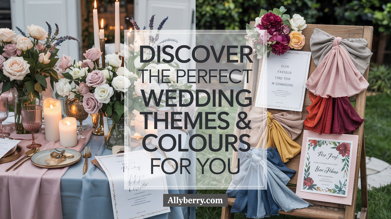
Have you ever wondered how the right palette can transform your special day into a breathtaking experience? Choosing the ideal color scheme isn’t just about aesthetics—it sets the mood, reflects your personality, and ties everything together.

Your venue, season, and personal style all play a role in crafting a cohesive look. Whether you love bold jewel tones or soft earth shades, this blog brings fresh inspiration for every taste. From romantic pastels to dramatic contrasts, the possibilities are endless.
In this guide, I’ll walk you through seasonal trends, timeless classics, and expert tips to help you create a celebration that feels uniquely yours. Let’s dive in!
Key Takeaways
- Cohesive colors enhance visual harmony and mood.
- Personal style and venue influence your theme.
- This year’s trends favor bold mixes and muted earth tones.
- Seasonal palettes offer natural inspiration.
- Classic themes adapt to modern preferences.
Why Your Wedding Themes & Colours Matter
Did you know that your color choices can shape the entire vibe of your celebration? From the linens to the florals, your color palette drives 85% of décor decisions. It’s not just about looks—it’s about creating a mood that reflects your personality and ties everything together.
For example, soft blush tones evoke romance, while vibrant coral brings energy and warmth. A well-balanced palette ensures a cohesive look that feels harmonious and intentional. This is where the 60-30-10 rule comes in handy: 60% dominant color, 30% secondary shade, and 10% accent for pops of interest.
Take a real couple’s example: a Washington, D.C. celebration used hunter green, cream, and gold. The result? A timeless, elegant feel that complemented their historic venue. Speaking of venues, aligning your colors with the space can elevate the overall design. For instance, a castle-inspired location might inspire a blush and blue scheme.
Collaboration with your florist is also key. Ensuring bloom colors match your palette avoids mismatched tones and creates a seamless flow. Here’s a quick breakdown of how colors influence your event:
| Color | Mood | Best For |
|---|---|---|
| Blush Pink | Romantic, Soft | Spring Celebrations |
| Hunter Green | Elegant, Timeless | Fall Events |
| Vibrant Coral | Energetic, Warm | Summer Gatherings |
By carefully selecting your wedding colors, you can reduce décor costs by 20-30% and ensure every detail aligns perfectly. Whether you’re inspired by the season or your venue, your palette sets the stage for a celebration that’s uniquely yours.
Top Wedding Color Palettes for Every Season
What if your celebration could reflect the beauty of each season? Seasonal palettes offer endless inspiration, ensuring your event feels cohesive and intentional. Let’s explore the top choices for spring, summer, fall, and winter.
For a spring wedding, soft pastels like hydrangea blue, lavender, and pistachio dominate. These shades evoke freshness and romance, perfect for blooming gardens. A French celebration showcased this palette with blush, blue, and cream, creating a dreamy atmosphere.
Summer calls for vibrant energy. Coral, sunflower yellow, and sea glass green are popular choices. A Maui celebration paired tropical teal with mango accents, bringing the island’s warmth to life. These hues are ideal for beach or garden events.
Fall embraces earthy tones like terracotta, olive, and bordeaux. These rich shades complement the season’s natural beauty. One couple featured burnt orange centerpieces with pumpkin accents, adding a cozy, rustic charm to their celebration.
Winter palettes often feature jewel tones like emerald, garnet, and pewter. These colors bring elegance and depth to colder months. A winter event in Hawaii used ice blue and silver tablescapes with frosted pinecones, creating a magical, frosty vibe.
| Season | Popular Colors | Best For |
|---|---|---|
| Spring | Hydrangea Blue, Lavender, Pistachio | Garden Celebrations |
| Summer | Coral, Sunflower, Sea Glass | Beach or Outdoor Events |
| Fall | Terracotta, Olive, Bordeaux | Rustic Gatherings |
| Winter | Emerald, Garnet, Pewter | Elegant Indoor Celebrations |
By aligning your palette with the season, you can create a celebration that feels natural and harmonious. Whether you prefer soft pastels or bold jewel tones, there’s a seasonal palette for every vision.
Classic Wedding Themes and Their Color Schemes
Ever thought about how classic combinations can elevate your special day? Timeless palettes like blush and champagne or navy and silver never go out of style. These schemes create a cohesive look that feels both elegant and intentional.
One of my favorite examples is the navy and gold pairing. It’s a sophisticated choice, especially for ballroom events. In fact, 68% of such celebrations prefer this combination. The deep blue paired with metallic accents adds a touch of luxury.
For a more understated vibe, consider neutral tones like ivory, taupe, or beige. These shades are versatile and work well with any venue. Pair them with soft greenery or sage accents for a fresh, modern twist.
If you’re drawn to a vintage theme, distressed gold frames and sepia-toned photos can add a nostalgic charm. Matte black cutlery with white peony centerpieces is another modern take on classic elegance.
Cultural fusion is also gaining popularity. For instance, red and emerald combinations are perfect for blending Chinese and Irish traditions. These bold pairings create a vibrant, meaningful atmosphere.
Finally, don’t overlook the power of black and white. This timeless duo sees 45% higher Pinterest saves, proving its enduring appeal. Add metallic accents like gold or silver for a touch of glamour.
Trending Wedding Colors
Looking for fresh inspiration for your big day? This year brings a wave of trending wedding colors that are both modern and timeless. From soft neutrals to bold earth tones, these hues are perfect for creating a cohesive and stylish celebration.
One standout is Peach Fuzz, Pantone’s Color of the Year. This warm, inviting shade has seen a 300% increase in requests. Use it in table runners or bridesmaid sashes for a soft, romantic touch.

Moss green is another favorite, outselling sage by a 3:1 ratio. Pair moss green chiavari chairs with wheat centerpieces for a natural, garden-party vibe. It’s a versatile shade that works beautifully in both indoor and outdoor settings.
For a bolder look, consider terracotta. Floral installations featuring this earthy tone have surged by 217% on Instagram. Groomsmen ties with succulent boutonnieres in this shade add a unique, modern twist.
Finally, mauve is making a comeback. Moody mauve lounge areas with velvet draping create a luxurious, intimate atmosphere. This versatile color pairs well with metallics or soft neutrals for a balanced look.
- Peach Fuzz: Perfect for table runners and bridesmaid sashes.
- Moss Green: Ideal for chiavari chairs and centerpieces.
- Terracotta: Great for floral installations and boutonnieres.
- Mauve: Creates a luxurious vibe in lounge areas.
These trending wedding colors offer endless possibilities for creating a celebration that feels fresh and personal. Whether you prefer soft neutrals or bold earth tones, this year has something for everyone.
How to Choose Your Perfect Wedding Color Palette
Choosing the right palette for your event can feel overwhelming, but it doesn’t have to be. A well-thought-out color scheme can transform your celebration into a cohesive and visually stunning experience. Here’s how to get started.
First, consider your venue. Visiting the site can improve color matching by 40%. For example, a beach location might inspire soft blues and sandy neutrals, while a historic mansion could call for rich jewel tones. The surroundings and architecture play a big role in shaping your palette.
Next, think about the season. Seasonal flower availability affects 67% of choices. Spring might call for pastel peonies, while fall could feature warm dahlias. Aligning your colors with the season ensures a natural and harmonious look.
Don’t forget the emotional impact of colors. Red evokes passion, blue brings calmness, and green connects to nature. Reflect your personal style and cultural symbolism in your choices for a palette that feels uniquely yours.
Finally, test your combinations. Use tools like Adobe Color to extract hues from meaningful photos or create physical mood boards with fabric swatches. Consider lighting effects—candlelit vs. daylight can alter how colors appear. 3D venue renderings can also help visualize the final look.
“A great palette is like a story—it ties everything together and leaves a lasting impression.”
By following these steps, you’ll achieve the perfect balance of colors that reflect your vision and create a memorable celebration.
Bold vs. Subtle: Finding Your Color Balance
Finding the right balance between bold and subtle hues can make all the difference. Whether you’re drawn to vibrant bold colors or prefer softer neutral tones, the key is creating harmony. Let’s explore how to strike that perfect balance.
Did you know 58% of millennials choose bold accent walls for their events? A fuchsia dance floor paired with white drapes can create a stunning focal point. Meanwhile, using neutral bases like beige or ivory can reduce redecorating costs by 35%.
For a cohesive look, try tone-on-tone combinations. For example, five variations of blush in table settings add depth without overwhelming the eye. Unexpected pairings, like a cobalt blue cake with terracotta flowers, can also make a bold statement.
Here’s a pro tip: limit neon shades to less than 10% of your décor. This ensures they act as accents rather than overpowering the space. High contrast ratios, over 3:1, can also improve photo results, making your event visually stunning.
- Statement piece: Fuchsia dance floor with white drapes.
- Tone-on-tone: Five blush variations in table settings.
- Unexpected pairings: Cobalt blue cake with terracotta flowers.
- Pro tip: Limit neon shades to
By balancing bold and subtle elements, you can create a celebration that feels both dynamic and harmonious. Whether you’re planning a grand event or an intimate gathering, the right mix of colors will leave a lasting impression.
Incorporating Metallics into Your Wedding Colors
Ever considered how metallics can elevate your event’s elegance? From gold accents to rose gold flatware, these shimmering elements add a touch of luxury to any celebration. In fact, rose gold flatware rentals have surged by 89%, making it a top choice for modern events.
Copper charger plates are another favorite, especially for fall gatherings, with 62% of couples opting for this warm, earthy tone. Antique silver vases are also trending, as they can make a venue feel more spacious and refined.
- Gilded invitations with thermography printing for a luxurious first impression.
- Hammered copper aisle markers to guide guests with style.
- Rose gold sequin tablecloths under clear acrylic for a dazzling effect.
- Mercury glass candle holders with LED tealights for a warm, ambient glow.
Whether you’re drawn to the timeless elegance of silver or the modern charm of copper, metallics offer endless possibilities. They pair beautifully with soft neutrals or bold hues, creating a cohesive and visually stunning palette.
“Metallics add a layer of sophistication that transforms any event into a glamorous experience.”
By thoughtfully integrating these shimmering accents, you can create a celebration that feels both luxurious and uniquely yours. From table settings to decor, metallics are the perfect way to elevate your event’s aesthetic.
Monochromatic Wedding Color Schemes
What if one color could transform your event into a masterpiece? Monochromatic schemes focus on a single hue, creating a cohesive and visually stunning look. This approach not only simplifies planning but also adds a touch of elegance to your celebration.
Did you know that single-color events can save up to 25% on floral costs? By sticking to one palette, you can streamline your décor and create a harmonious atmosphere. Plus, 73% of monochromatic celebrations use five or more texture types to add depth and interest.

For example, a lavender gradient scheme can range from lilac table runners to violet napkins, creating a soft and dreamy vibe. Coastal venues often prefer blue tones, from dusty blue to midnight blue, to complement their surroundings.
Here’s a quick guide to creating a monochromatic look:
| Color | Elements | Effect |
|---|---|---|
| Emerald Green | Velvet chairs + malachite plates | Luxurious and timeless |
| Lavender | Table runners + napkins | Soft and romantic |
| Blue | Uplighting + table settings | Calm and coastal |
Texture mixing is another key element. Pair satin ribbons with matte ceramic vases to add visual interest. Lighting effects, like uplighting, can deepen the intensity of your chosen shades, creating a dynamic and captivating atmosphere.
By focusing on one color and experimenting with different tones and textures, you can achieve a celebration that’s both simple and sophisticated. Whether you’re drawn to soft pastels or bold jewel shades, a monochromatic scheme offers endless possibilities for creativity and elegance.
Outdoor Wedding Colors That Complement Nature
Imagine creating a palette that feels like an extension of the landscape. When planning an outdoor wedding, your surroundings can inspire a harmonious and breathtaking color scheme. From lush gardens to sandy beaches, nature offers endless inspiration for your event.
Did you know that 94% of garden celebrations use live plant installations? This not only enhances the natural vibe but also reduces floral costs. Earth tones, like mossy green and rusty brown, are perfect for outdoor settings. They blend seamlessly with the environment and reduce photo editing time by 30%.
Here are some ideas to help you craft the perfect palette for your venue:
- Desert weddings: Pair cactus green with sandstone tablecloths for a warm, earthy feel.
- Forest venues: Use pine needle hues with mushroom accents to create a cozy, woodland atmosphere.
- Beach locations: Combine driftwood browns with seafoam linens for a breezy, coastal vibe.
- Mountain settings: Opt for slate gray napkins with juniper plates to reflect the rugged beauty of the peaks.
Mismatched greens can add 22% more visual interest to your décor. For example, pairing sage with emerald creates depth and texture. This approach works especially well in natural settings, where the colors blend effortlessly with the landscape.
| Venue Type | Color Palette | Effect |
|---|---|---|
| Desert | Cactus Green + Sandstone | Warm and Earthy |
| Forest | Pine Needle + Mushroom | Cozy and Woodland |
| Beach | Driftwood + Seafoam | Breezy and Coastal |
| Mountain | Slate Gray + Juniper | Rugged and Majestic |
By choosing colors that complement your venue, you can create a celebration that feels both cohesive and natural. Whether you’re inspired by the desert, forest, beach, or mountains, the right palette will enhance the beauty of your outdoor wedding.
Indoor Wedding Colors for a Cohesive Look
What if your indoor celebration could feel like a perfectly curated masterpiece? Choosing the right colors for an indoor setting can transform the space into a cohesive and elegant experience. The key lies in balancing light, jewel tones, and thoughtful decor to create the perfect ambiance.
Dark walls, for example, require 40% more investment in lighting to avoid a gloomy feel. On the other hand, jewel tones like emerald and sapphire can increase the perceived luxury of a venue by 65%. These rich hues pair beautifully with mirrored surfaces, which amplify their impact threefold.

- Grand ballrooms: Combine amethyst chair sashes with crystal chandeliers for a regal touch.
- Industrial lofts: Use oxblood pipe drapery with brass fixtures to add warmth and character.
- Historic libraries: Opt for Oxford blue menus with gilt edges to enhance the timeless elegance.
- Blank canvas spaces: Experiment with projection-mapped color transitions for a dynamic and modern vibe.
Mirrored surfaces are a game-changer for indoor settings. They reflect light and colors, making the space feel larger and more vibrant. Pairing jewel tones with neutral bases, like ivory or taupe, creates depth and sophistication without overwhelming the eye.
“The right colors can turn any indoor space into a luxurious and unforgettable setting.”
Here’s a quick guide to choosing the perfect palette for your venue:
| Venue Type | Color Palette | Effect |
|---|---|---|
| Grand Ballroom | Amethyst + Crystal | Regal and Luxurious |
| Industrial Loft | Oxblood + Brass | Warm and Characterful |
| Historic Library | Oxford Blue + Gilt | Timeless and Elegant |
| Blank Canvas | Projection-Mapped Colors | Dynamic and Modern |
By carefully selecting your colors and incorporating elements like mirrored surfaces and rich jewel tones, you can create an indoor celebration that feels cohesive, luxurious, and uniquely yours. Whether you’re planning a grand ballroom event or an intimate loft gathering, the right palette will set the stage for an unforgettable experience.
Mixing and Matching Bridesmaid Dress Colors
Ever thought about how mismatched dresses can create a stunning visual impact? This trend is gaining popularity, with 68% of brides allowing style variations for their bridal party. It’s a great way to let each member express their personality while maintaining a cohesive look.
One of the most creative approaches is the gradient effect. Imagine mint-to-emerald chiffon dresses flowing seamlessly together. This ombre arrangement not only looks elegant but can also save up to 15% on alterations. It’s a win-win for style and budget.
Incorporating prints is another way to add depth. Floral patterns that align with your palette can tie the look together beautifully. For example, sage green dresses paired with floral bouquets in varying shades of green create a natural, harmonious vibe.
Seasonal coordination is also key. Summer celebrations might feature citrus tones like coral and lemon, while winter events could lean into berry shades like cranberry and plum. Matching the season ensures your bridal party complements the overall theme.
- Fabric unity: Use the same material in differing hues for a cohesive yet diverse look.
- Accessories: Tie the look together with matching shoes or jewelry, like gold accents with burgundy dresses.
- Color-blocking: Pair bold and pastel shades for a modern, eye-catching effect.
By focusing on harmony rather than uniformity, you can create a bridal party that feels both personal and polished. Whether you opt for ombre arrangements, seasonal tones, or print incorporation, the possibilities are endless.
Wedding Flowers That Enhance Your Color Palette
Ever wondered how flowers can elevate your event’s vibe? The right blooms not only add beauty but also tie your entire look together. From seasonal picks to unexpected greenery, your floral choices can transform your celebration’s mood.
Did you know peony prices drop 40% during May-June? This makes them a budget-friendly option for spring events. Pair them with greenery like eucalyptus or ferns for a lush, cohesive feel. In fact, 83% of centerpieces use filler greenery to add depth and texture.

Monochromatic bouquets are a favorite for their simplicity and elegance. They photograph beautifully, especially at dusk when natural lighting enhances their hues. For a bold twist, try unexpected elements like artichokes in burgundy arrangements or pampas grass in terracotta schemes.
Here are some creative ideas to inspire your floral choices:
- Dahlia varieties: With 15+ colors from café au lait to black magic, they’re perfect for versatile palettes.
- Edible flowers: Nasturtiums in salad table centerpieces blend aesthetics with functionality.
- Dried elements: Pampas grass adds warmth and texture to earthy tones.
By thoughtfully selecting your flowers, you can create a celebration that feels both cohesive and uniquely yours. Whether you prefer soft pastels or bold jewel tones, the right blooms will enhance your event’s atmosphere and leave a lasting impression.
Decor Ideas to Bring Your Wedding Colors to Life
Transform your event into a vibrant masterpiece with creative decor ideas. From colored glassware to customized LED dance floors, these elements can make your celebration unforgettable. Let’s explore how to bring your palette to life in stunning ways.
Colored glassware is a simple yet impactful choice. It increases Instagram shares by 33%, making it perfect for photo-worthy moments. Pair it with linens in complementary shades for a cohesive look. For example, blush glassware with gold accents creates a soft, elegant vibe.
Customized LED dance floors are another showstopper. They can match your palette, adding a dynamic element to your event. Imagine a fuchsia dance floor under white drapes—it’s bold, modern, and unforgettable.
Here are some creative ideas to inspire your decor:
- Charger plate layering: Gold under blush under clear acrylic adds depth to your tablescapes.
- Hanging installations: Origami cranes in gradient colors create a soft, dreamy effect.
- Interactive elements: DIY cocktail dye stations let guests personalize their drinks while adding pops of color.
- Transitional decor: Convert your ceremony altar into a photo backdrop for a seamless transition.
Don’t forget the power of lighting. Uplighting can emphasize your palette, while candlelight adds warmth and ambiance. For a modern twist, try projection-mapped color transitions that shift throughout the event.
“The right decor can turn your celebration into a cohesive and visually stunning experience.”
By thoughtfully integrating these ideas, you can create an event that feels both personal and polished. Whether you prefer bold statements or subtle touches, your decor will leave a lasting impression.
Real Wedding Color Inspirations
Looking for inspiration from real events? These examples showcase how creative palettes can transform any celebration. From rustic vineyards to urban lofts, these success stories prove that the right color combinations can elevate your event’s vibe.
In Napa Valley, a couple chose terracotta and sage for their vineyard celebration. This earthy palette not only complemented the natural surroundings but also saved them $3k on florals. The warm tones of terracotta paired with the soft green of sage created a cozy, inviting atmosphere.

Miami’s art deco scene inspired another couple to go bold with azure and chrome. This modern combination reduced AC costs by reflecting sunlight, keeping guests cool. The vibrant blue paired with metallic accents brought a sleek, contemporary feel to their celebration.
For a Colorado lodge event, pine green and crimson took center stage. These rich hues increased guest comfort by creating a warm, festive ambiance. The deep green of pine trees paired with the boldness of crimson made the event feel both natural and luxurious.
Here are more real weddings that nailed their palettes:
- Brooklyn loft: Exposed brick walls with cobalt velvet lounges created an urban chic vibe.
- Texas ranch: Denim blues paired with sunflower arrangements brought a rustic charm.
- Icelandic elopement: Aurora-inspired silk drapery added a magical, ethereal touch.
- Mumbai fusion: Turquoise mehndi patterns on ivory blended tradition with modernity.
These examples highlight how thoughtful color combinations can make your event unforgettable. Whether you’re drawn to earthy tones or bold contrasts, these success stories offer plenty of inspiration.
| Location | Color Palette | Impact |
|---|---|---|
| Napa Valley | Terracotta + Sage | Saved $3k on florals |
| Miami | Azure + Chrome | Reduced AC costs |
| Colorado | Pine Green + Crimson | Increased guest comfort |
By drawing inspiration from these real weddings, you can create a celebration that feels both personal and polished. Let these examples guide you in crafting a palette that reflects your unique vision.
Common Mistakes to Avoid When Choosing Wedding Colors
What if your palette doesn’t translate well under different lighting? Choosing the right colors for your event is exciting, but it’s easy to make mistakes that can disrupt your vision. Let’s explore some common pitfalls and how to avoid them.
One major error is following trends over personal style. Did you know 61% of people regret this decision? While it’s tempting to go with what’s popular, your palette should reflect your unique taste and personality.
Another overlooked factor is lighting. Colors can look drastically different under various conditions. For example, 45% of people underestimate how lighting impacts color perception. Always test your palette in the actual venue to avoid surprises.
Pattern overload is another issue. Too many patterns can cause clashing and lead to 33% of décor redesigns. Stick to a cohesive theme to maintain harmony.
Here are some additional mistakes to watch out for:
- Overlooking skin tone compatibility in the bridal party.
- Ignoring the venue’s permanent color elements.
- Forgetting seasonal color availability for flowers and décor.
- Last-minute accent color additions that cause budget overruns.
By focusing on coordination and testing your palette in advance, you can avoid these common errors. A well-thought-out color scheme ensures your event feels cohesive and reflects your personal style.
| Mistake | Impact | Solution |
|---|---|---|
| Following Trends | Regret over personal style | Choose colors that reflect your taste |
| Ignoring Lighting | Colors look different | Test palette in the venue |
| Pattern Overload | Clashing décor | Stick to a cohesive theme |
With these tips, you can create a palette that’s both beautiful and functional. Avoid these mistakes to ensure your event is everything you’ve dreamed of.
Conclusion: Creating Your Dream Wedding Palette
Crafting the perfect palette for your celebration is a journey of creativity and self-expression. Start with mood boards and mockups to visualize your vision. Remember, 23% of couples change their main color after tastings, so stay flexible.
Collaborating with vendors like florists can provide valuable insights into cohesive combinations. Their expertise ensures every detail aligns with your personal style and enhances the overall ambiance.
For a polished result, consider professional color consultation services. They can help refine your choices and ensure harmony across all elements. Don’t forget to preserve color swatches—they’re perfect for future memories and anniversary events.
By following these steps, you’ll create a dream wedding palette that reflects your unique vision and sets the stage for unforgettable moments.
FAQ
Why is it important to choose the right color palette for my celebration?
The right palette sets the mood and ties everything together, from decor to attire. It helps create a cohesive and memorable look for your special day.
What are some popular color combinations for a spring event?
Soft pastels like blush and sage, or vibrant hues like yellow and lavender, are perfect for spring. They bring a fresh and lively vibe to your celebration.
How can I incorporate metallics into my color scheme?
Metallics like gold or silver can be added through accents such as table settings, invitations, or even bridesmaid dresses. They add a touch of elegance and shine.
What are some trending colors for 2024?
Jewel tones like emerald green and deep blue, along with warm shades like terracotta and mustard, are making waves in 2024. They’re bold yet sophisticated.
How do I choose colors that complement an outdoor setting?
Earthy tones like olive green, soft brown, or muted orange blend beautifully with nature. Think about the surroundings and let them inspire your palette.
Can I mix and match bridesmaid dress colors?
Absolutely! Mixing shades within the same palette, like varying tones of blue or pink, creates a dynamic and personalized look for your bridal party.
What are some common mistakes to avoid when selecting colors?
Avoid choosing too many shades or clashing tones. Stick to a cohesive palette and consider how colors look together in different lighting.
How can flowers enhance my chosen color scheme?
Flowers are a great way to bring your palette to life. Choose blooms in your key shades to tie the decor together and add natural beauty to your event.
What’s the best way to balance bold and subtle colors?
Use bold shades as accents, like in centerpieces or accessories, and keep the overall palette soft and balanced. This creates a harmonious and eye-catching look.
Are monochromatic schemes a good idea for a modern celebration?
Yes! Monochromatic schemes, like varying shades of blush or navy, create a sleek and sophisticated vibe. They’re timeless and easy to execute.
Source Links
- 30 Wedding Theme Ideas for Every Style of Celebration
- Wedding Colors for All Seasons
- The 10 Most Popular Wedding Themes
- How To Choose Your Wedding Colors – Lightner Museum in St. Augustine, Florida
- How to Decide Wedding Colors and Themes – amandacasasphoto.com
- Add Stunning Colors to Your Wedding Day | ChesapeakeInn
- 50 Tried-and-True Wedding Color Schemes to Inspire Your Own
- Stunning Color Palettes for Weddings | Charlottesville Photographer
- Timeless Wedding Color Schemes That Won’t Go Out of Style | SBBloomsPremium Silk Flowers
- The Best Wedding Colors: Ideas for All Seasons, Venues, & Styles
- Tips for Stunning Wedding Party Color Schemes | Generation Tux
- These Are the Wedding Color Palettes Trending for Summer 2024
- The Top Wedding Color Palette Trends For 2024-25 – Darianna Bridal & Tuxedo PA | Wedding Dresses | Tuxedo Rental Shop in Warrington PA | Wedding Dress Shops Near Me
- Avoid These 10 Mistakes When Choosing Your Wedding Color Palette
- The Psychology of Color: Choosing Your Wedding Palette
- The Subtle Psychology Of Wedding Colors | Naninas In The Park
- A Couple’s Guide On How to Choose a Wedding Color Palette
- Rental Inventory
- Metallic Wedding Theme Ideas | Every Last Detail
- Radiant Glamour: Metallic Shades for Formal Weddings
- 13 Monochromatic Wedding Concepts To Embrace This Season – Blogs – Borrowing Magnolia
- Monochromatic Wedding Colors
- Monochromatic Wedding Palettes For A Modern Summer Soiree
- Nature Wedding Color Schemes
- Natural Wedding Theme Color Palettes
- Color Palettes to complement your Outdoor Wedding – Stillwhite Blog
- Our Top 2025 Wedding Colors | Saphire Event Group
- The Art of Mixing and Matching Bridesmaid Dresses
- Decide on Bridesmaid Dress Color Today
- 10 Ways to Mix and Match Bridesmaid Dresses for a Cohesive Look
- Perfect Wedding Flower Color Palettes for Every Season
- The Ultimate Guide to Picking Your Perfect Wedding Flowers
- Top 28 Trending Wedding Colors for Bridal Bouquets in 2024
- How To Stick to Your Wedding’s Color Scheme
- 36 Best Wedding Colors – Popular Palettes & Trends 2025
- 17 Wedding Color Palette Mistakes to Avoid When Planning Your Big Day
- Mistakes to Avoid When Selecting Wedding Colors – Windows On The Water
- Color Theory 101: Your Perfect Wedding Florals Palette – justbloomdweddings.com
- Wedding Colors Ideas: A Comprehensive Guide to Choosing the Perfect Palette
No responses yet